pornjk.com npornk.com dpornk.com apornk.com zpornk.com xxxpornk.com xxxpornd.com sexpornd.com mpornk.com justpornk.com yespornk.com porn100.tv foxporn.me

Portfolio: The Financial Times — ‘About us’

Project overview

FT: Financial TimesJuly — November 2010

The ‘About us’ section of the FT.com website was being updated and the content migrated from its current CMS to the WordPress platform.

The copy needed reviewing and rewriting or editing to make it as informative and engaging as possible. It also had to be ‘SEO friendly’.

Visit the FT.com ‘About us’ website.

Tasks

  • Rewriting and editing content (body text, meta data such as <description>, alternative text, ‘micro copy’).
  • Producing ‘web friendly’ content that was accessible, usable and optimised for both people and search engines.
  • Uploading and editing content using the WordPress CMS, and providing support to the client on related queries (e.g. HTML coding to format text).

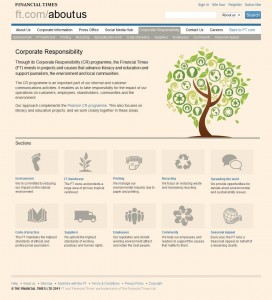
Example: ‘Corporate Responsibility’ landing page

Screen grab of 'Corporate Responsibility' page

(Click on the image for a larger version.)

Contact me to find out more about this project or to talk about working together.

Story of a logo

I’ve been intending to talk a bit about my new logo since the updated site went live a few months ago. A featured post interviewing the logo’s designer, the talented Mariana Murabito at Monok, on popular blog LogoGala has kicked me into action.

It was important to me to establish a brand from day one of freelancing, to make me look professional, credible and also memorable. I spent quite some time thinking up a name that described the service I offered, then used the logo on my website, invoices, quotes and other documents.

In the beginning, there was…

The first design was my amateur attempt using Photoshop. I’m sure it would have made any ‘proper’ designer have kittens! However, as I was starting out with little funds, it was the best solution at the time.

Concise Content
The original, amateur logo

I can’t say I gave any reasoned thought to its appearance; I tried out some simple colourways that I liked and chose a font that was easy to read (reflecting online best practice for web-friendly typefaces).

A sleeker and more professional look

Two years into freelancing, it was time for a fresh look for both the logo and the website. I’d been working with the team at Monok and had already admired Mariana’s work for other brands. So, as she knew my services and my personality, it seemed logical to ask her to come up with something for me.

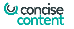
Concise Content
The updated, fresh and modern logo

The end result speaks for itself; it’s modern, easy to read and includes a unique ‘speech bubble’ device (based on the two ‘C’s of the brand name and the copyright mark) that can be used on its own.

Read the interview with Mariana on the LogoGala blog or visit web agency Monok’s website to find out more about the company’s work.

Keep it simple

I’m a big fan of plain English on websites for a wide variety of reasons, most of which boil down to reaching the widest audience possible. While there are of course instances where more flowery language is appropriate, communicating important information is not usually one of them.

So if there’s an easier way to say something, use it. And this is what went through my mind as I was browsing the Climate Action website today, when I saw its strapline:

Assisting business towards carbon neutrality

As the platform is produced in partnership with the United Nations Environment Programme (UNEP), I think it’s fair to assume the target audience is at least Europe-wide. The majority of those people will speak English as a second language.

Even though English is my native language, I still need a split second to unravel the meaning, which isn’t ideal. In addition, the wording has a distinct whiff of ‘corporate speak’. I think the following is clearer while still saying exactly the same thing:

Helping business become carbon neutral

What’s your opinion?

Climate Action | Assisting business towards carbon neutrality

Fix-It Friday (No. 3): Energy Institute

Fix-It Friday is a series of posts where I show how a website page can be improved by applying a few web copywriting principles. My primary aim is to make visitors’ lives easier.

Within just an hour, it’s possible to make a page more readable, accessible and search friendly. I also explain what else I’d do if I had more time. Look at the difference a web copywriter can make!

The Energy Institute (EI) is the professional body for the energy industry. It develops and shares knowledge, skills and good practice, while supporting over 14,000 individuals and 300 companies across 100 countries.

The EI website looks great — modern, fresh, professional and easy to navigate. I’m going to look at its ‘About us’ page from a web copywriting perspective.

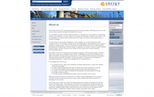
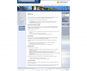
Web page before

(Click on the image for a larger version.)
Image of web page before

Good points

  • Individual <title> tags for each page
  • Use of H1 tag for page heading
  • Contains plenty of well-written information, including who the EI serves and its purpose
  • Some links to other pages on the website
  • A web-friendly list is used
  • The page URL is descriptive
  • ‘Skip to content’ link included for accessibility
  • Alt tags used correctly on images that contain information, e.g. the EI logo

Could do better

  • No sub titles used to break up the text, which is wordy and dense in appearance
  • Copy would benefit from better formatting, such as shorter paragraphs and more lists
  • Key phrases need highlighting in <strong> tags for both reader and search benefits
  • No alt tags for primary-level navigation; it disappears when images are disabled!
  • The “description” and “keywords” elements exist but haven’t been used
  • Image alt tags used in places that don’t need them, e.g. “Banner” on banner image (no information is contained within)
  • The <title> tag could be tweaked to greater effect

Web page after

(Click on the image for a larger version.)
Image of web page after edits

Fixes made in one hour

  • Simplified and shortened sentences for easier reading and to be more ‘web friendly’
  • Cut out some text duplicated on other pages
  • Improved the layout and presentation of the copy
  • Added sub titles in appropriate H2 header tags to clearly identify the main sections
  • Added further links from key phrases to both internal and external web pages
  • Highlighted other key words and phrases in <strong> tags
  • Placed suitable information into proper lists

If I had more than an hour, I’d…

  • Further review and simplify the language used (e.g. ‘share’ instead of ‘disseminate’) — ‘plain English’ considering the EI’s global audience
  • Write “description” and “keywords” tags
  • Review image alt tags
  • Make sure links are also underlined (not just highlighted in a different colour) for accessibility reasons
  • Review the <title> element slightly
  • Maybe add anchor links from the top of the page to each H2 header, as the page is quite long

Do you want me to make over a page on your website? If you’d like to suggest a site for me to consider, get in touch!

Fix-It Friday (No. 2): World Economic Forum

Fix-It Friday is a new series of posts where I show how a website page can be improved by applying a few web copywriting principles. My primary aim is to make visitors’ lives easier.

Within just an hour, it’s possible to make a page more readable, accessible and search friendly. I also explain what else I’d do if I had more time. Look at the difference a web copywriter can make!

The World Economic Forum (WEF) is an independent, not-for-profit and international organisation. Its aim is to improve ‘the state of the world by engaging leaders in partnerships to shape global, regional and industry agendas’.

I’m going to look at the WEF’s ‘Social media: Twitter’ page from a web copywriting perspective.

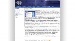
Web page before

(Click on the image for a larger version.)

Good points

  • Individual <title> tags for each page
  • Sub titles are used to break the text up
  • Clearly describes what users can expect (including benefits) if they follow the Twitter feed
  • Good number of links to both internal and external web pages
  • The page URL is descriptive

Could do better

  • Header tags (H1, H2, etc) haven’t been used for title and sub title elements
  • The text is wordy and dense in appearance
  • Copy would benefit from better formatting
  • Key phrases need highlighting in <strong> tags
  • There doesn’t appear to be a “description” or “keywords” element
  • The <title> tag could be tweaked to greater effect

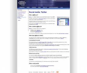
Web page after

(Click on the image for a larger version.)

Fixes made in one hour

  • Simplified the language — ‘plain English’ (considering the WEF’s global audience)
  • Improved the order, layout and presentation of the copy
  • Placed all titles into appropriate header tags
  • Added additional sub titles to break up text
  • Added further links from key phrases where appropriate
  • Highlighted other key words and phrases in <strong> tags
  • Placed suitable information into proper lists
  • Moved the image and added a greater margin

If I had more than an hour, I’d…

  • Write “description” and “keywords” tags
  • Review the <title> element

Note: Within the copy, I did not change ‘organized’ to ‘organised’ because this appears to be the WEF’s house style.

Do you want me to make over a page on your website? If you’d like to suggest a site for me to consider, get in touch!